


A Look At The First iMac Design: 25 Years Later2023 marked the 25th anniversary of the iMac. On May 6, 1998, Steve Jobs pulled away a black cloth and unveiled the first iMac. It was Jobs’ first product launch since his return to Apple the year prior. Jobs had big plans to simplify Apple’s product line, breaking it into four markets: pro desktop, pro mobile, consumer desktop, and consumer mobile.
The iMac was Jobs’ answer to the consumer desktop market. It was an all-in-one personal computer with one of the major selling points being: to get on the internet fast and easy. The internet was taking off in the late 90s as more people were getting online. The ‘i’ in iMac stands for internet. The iMac had another appeal: its design. Before the iMac, the beige, bulky boxes that were personal computers were becoming all too boring. Even Apple had beige computers. The reason these old PCs were beige is not totally clear, but while I was just a kid in the late 80s, I don’t think we thought they were so ugly back then. However, by 1998, the market was ripe for a more attractive PC. As we look back to what seems to be a simpler time and celebrate iMac’s 25th year, let’s break down the design of the 1998 iMac. I should clarify what iMac we’re talking about. The 1998 iMac was more commonly known as the “iMac G3” for its use of the G3 PowerPC processor chip. Apple followed up with an updated iMac G3 in 1999. The 1998 iMac came in only one color, Bondi Blue, which was not available with the 1999 models. So, we are talking about the first iMac—the 1998 iMac G3. There are three big distinctions you’ll first notice when looking at the first iMac: its shape, its material, and its color.
Shape: The Friendly OvoidFirst, the shape. Looking directly from the right side, the front leans slightly back and meets the top at a rounded corner. The top and bottom begin perpendicular to the front until both edges flow gently backward meeting in a half-spherical rear. Seeing as this all-one-computer has a CRT monitor in it, the shape was very similar to computer monitors of the 90s. But instead of the blocky elongated profile of a typical monitor back then, every corner of the iMac was rounded off into a sideways egg or ovoid shape. 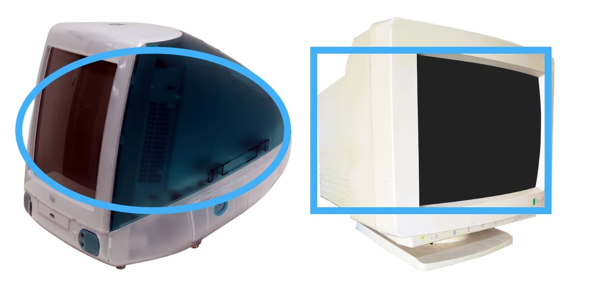
According to Leander Kahney’s book, Jony Ive: The Genius Behind Apple’s Greatest Products, the iMac’s distinctive shape and dedication to rounded edges was due to the design team’s goal to make the consumer product inviting, playful, and fun. Interestingly, one of the designers on the team, Doug Satzger, was inspired by some of the design work he did designing TVs at Thomson. I don’t know if what he shared with his fellow Apple designers was anything that came to fruition at Thomson, but he did sketch out a drawing of an ovoid-shaped TV. Apple’s lead designer at the time, Jony Ive, and the team were attracted to the ovoid shape and went from there. 
After searching around the internet for what Thomson TVs looked like in the 80s or early 90s, it’s likely these rounded-edge TVs from Thomson were possibly some of the TVs Satzger worked on, and that possibly inspired Apple to find the shape of the first iMac. The ovoid-shaped iMac with its exaggerated curves invited a person to put their arms around it. In fact, at the top of the iMac was a large sturdy inset handle. This all-in-one computer with a CRT monitor inside was almost 40 pounds, so you probably wouldn’t want to haul it around all that often. Nonetheless, the handle was just another sign to the user that the computer wants to be as friendly and inviting as possible. Material: Transparent Tech’s Big DayThe second distinction of the first iMac was the material that forms its enclosure. The enclosure was entirely made of plastic, but it’s more than just plastic. In a New York Times article covering the launch of the iMac in 1998, Peter H. Lewis reported that it was made of a “polycarbonate composite that is also used to make bulletproof glass.” This polycarbonate surrounded the entire iMac. Besides the face of the computer, the rest of the enclosure was clear, see-through plastic. The material was not entirely clear or transparent, however. In Apple’s coffee table book published in 2016, Designed by Apple in California, it mentioned that “light diffusing particles” were added to the polycarbonate. This gave the plastic a frosty look so the internal components were blurred but still visible. In fact, because the inner components were going to be visible, Jony Ive insisted they be arranged and presented as neatly as possible. The iMac was not the first product to sport a transparent enclosure exposing the electronics inside. Nearly 10 years prior, Conair’s clear phone made its debut. In the mid-90s, Swingline came out with a clear stapler. Even Apple had already used clear plastic in their products. A year prior to the iMac, Apple released the Newton eMate 300, a personal digital assistant, with a dark green transparent enclosure. The eMate was discontinued less than a year later. This trend of transparent products continued with future Apple products. That same year, Apple introduced the flat-panel 15” Studio Display with its legs and outer edges made of clear polycarbonate. In 1999, the Power Mac G4 complemented the iMac in design. The transparent material surrounding the iMac made an immediate connection to the person beholding it. Letting the person see the insides tells them that it had nothing to hide. It opened itself to vulnerability thereby establishing trust with the user. Color: Seventy Years in the MakingAs I mentioned before the only color the iMac first came in was Bondi Blue. Accents on the front, the logo on top and back, an extendable foot underneath, and the top two-thirds of the body enclosure were all presented in the translucent Bondi Blue color. The remaining parts including the handle on top, the lower one-third of the enclosure, and the front face all show in a frosted translucent “Ice” white. Kahney reported in his book that the design team looked at various objects to find the right color and material. One such item was a piece of aqua-colored beach glass. Each of these pieces of glass has a story of their own. Some are decades old starting out as beer bottles, soda bottles, or jars. The glass ends up in the ocean, breaks into pieces, makes their way to a beach, and are smoothed over and over by sand and water until they are picked up by a passerby. 
Of course, beach glass comes in whatever color the original glass was. One popular jar color between 1910 and 1930 was Ball’s “aqua” colored jars, often referred to as “Ball blue.” It’s safe to assume that the beach glass the iMac design team was looking at was a piece of glass from one of these Ball blue jars and was likely over 70 years old. It was this Ball blue beach glass color that inspired the color and translucent material of the iMac. Chief designer, Jony Ive thought the color reminded him of the water at Bondi Beach near Sydney, Australia. Thus, the name Bondi Blue was born. ConclusionAs we’ve seen, the first iMac got its distinctive look from a special combination of shape, material, and color. This fresh new take on what a personal computer could look like opened Apple up to a whole generation of consumer electronics. Eventually the iMac and later Apple’s consumer laptops became the hub for consumers to live a digital lifestyle as digital photos, videos, and music grew in popularity. The first iMac set a precedent of design quality for Apple. Its products that followed were just as thoughtfully designed. Even today, 25 years later, when you buy an Apple product, the material and design choice tell a story much like the original iMac: you are getting a friendly, inviting device that inspires. |